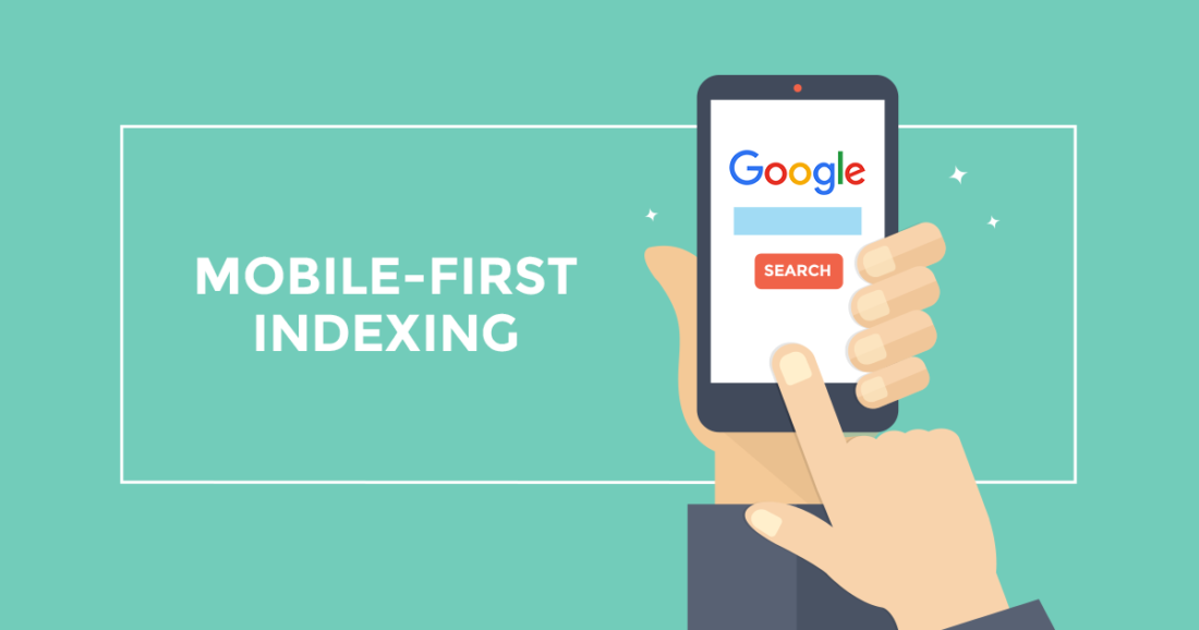
What You Need to Know About Mobile-First Indexing
Google gives greater weightage to websites that adopt a mobile first approach when determining search engine rankings.
When did you last use a desktop computer to conduct an internet search?
Searches conducted on mobile devices now outnumber those conducted on desktop computers for the first time.
Google has been working on mobile-first indexing for a few years now, in response to the dramatic change in how people conduct online searches.
Learn all about Google’s new mobile-first indexing strategy in this in-depth blog post. Let’s jump right in and begin.
In Other Words, What Exactly Is Mobile-first Indexing?
Google will give more weight to the mobile version of your site when determining your search engine rankings, as the name suggests.
But that doesn’t mean Google only looks at your mobile site when determining your ranking.
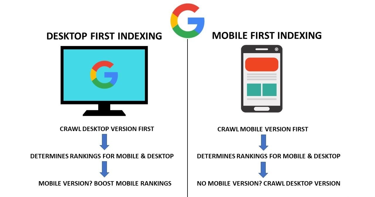
Is it possible, then, that Google maintains not one but two separate indexes?
No.
“It’s important to note that there isn’t a separate mobile-first index; Google Search continues to use only one index,” Google says. No matter what device a user is using, Google Search will always display the most relevant URL (desktop or mobile).
However, if you have separate URLs for the desktop and mobile versions, Google will direct desktop users to the desktop URL and mobile users to the mobile URL.
However, the mobile version will be indexed first.
Are Mobile-First Indexing And Mobile Usability The Same?
Naturally, you can check how well your site works on various mobile devices.
Know how well your site performs on mobile devices with Google’s Mobile-Friendly Test Tool.
Simply enter the URL of the page you want to check and the tool will return any potential problems with the site’s usability on mobile devices.
So, does mobile-first indexing mean the same thing as mobile-friendly design?
No.
Common people often think that.
“Mobile usability is completely separate from mobile-first indexing,” says John Mueller, a Google employee. Although mobile-friendliness isn’t necessarily a prerequisite for indexing, a site may still have all the relevant information.
To illustrate, let’s look at an example from Mueller himself.
“As an extreme case, consider how difficult it is to work with a Portable Document Format (PDF) file on a mobile device. It will be difficult to use the site because the links won’t work and the text won’t be legible. However, all of the text remains, and it would be perfectly suitable for mobile-first indexing.
Therefore, domains that do not have a dedicated mobile site but still function on mobile devices can be included in mobile-first indexing.
A look at the timeline Mobile First Indexing
It’s been a while since Google first implemented mobile-first indexing, so let’s take a look at how far it’s come.
- Google’s mobile-first indexing experiments began in November 2016.
- As of December 2017, Google has been checking sites to see if they are mobile-friendly enough to be indexed first.
- Launched in March 2018, mobile-first indexing prioritises the convenience of mobile devices.
- As of July 2019, all new sites were expected to have mobile first indexing
- 70% of Google’s index switched to mobile-first indexing by March 2020.
The Advantages Of Indexing Content For Mobile Devices.
There is no longer any room for debate; mobile-first indexing is required.
Why?
Let’s say you’ve done a great job of optimising the desktop version of your site to bring in visitors, but your site isn’t optimised for mobile users.
Now that Google prioritises mobile-friendly content, if your mobile site isn’t up to par, it will hurt your rankings more than if they were stellar on a desktop.
Furthermore, your competitors who have a mobile-friendly site will leapfrog you in search engine rankings.
Also, if your site isn’t optimised for mobile devices like smartphones and tablets, visitors from those devices will probably go elsewhere.
That will cause a significant drop in mobile site visitors. In an era where more and more people are conducting web searches on their mobile devices, that is not a good sign for your site’s traffic.
You can increase your site’s visibility in Google search results by making it mobile-friendly.
Do you wish to have your site optimised for mobile-first indexing? We’ve got your back. Yes, let’s have a chat.
Guidelines for Making Your Site Mobile-Friendly
Now more than ever, having a mobile-friendly site is crucial, as Google prioritises mobile-first indexing.
While Google is gradually rolling out mobile-first indexing for legacy sites, the company recently announced that it would be the default for all sites created on or after July 1, 2019.
Even if Google bots haven’t visited your site before, this still applies.
Here is a look at the best practises you should follow to prepare your site for mobile-first indexing.
Allow access to your Content
You must make it possible for Google’s crawlers to access your content on the mobile version of your site if you want Google to index and rank it.
Check the robots.txt file to make sure it is not hiding any crucial sections of your site from search engines, especially on mobile.
You should use the same meta robot tags for desktop and mobile versions, according to Google’s recommendations.
Once mobile-first indexing has been activated for your site, Google may not crawl and index your content if you’ve used different meta robot tags.
Primary Content – The Need To Ensure That Lazy Loading Does Not Occur
If you want people to interact with your site, visitors shouldn’t have to wait for the sections that contain that content to load.
There is a wide variety of possible interactions, such as clicking, swiping, and typing.
Be sure that Google can see your lazy-loaded content. To put it another way, Google will be able to crawl your assets in this way.
Share Identical Content On Mobile And Desktop Versions
Does the mobile version of your site have less information than the desktop version?
If this is the case, you need to consider a content refresh.
Web traffic will suffer if you don’t provide as much information on your mobile page.
Google suggests that you maintain consistency between your website’s mobile and desktop versions.
With mobile-first indexing, your mobile page’s content will be the same as that of your desktop version.
However, a different layout can be used for the mobile version to improve usability.
Ensure Consistency In Both Versions
Create headings that are unambiguous, simple, and direct. In both the mobile and desktop versions of your site, use the same headings.
Headings make it simple for both humans and search engines to determine whether or not your content is relevant to a given query.
To increase your site’s conversion rate and attract more targeted visitors, use heading tags effectively.
Same Structured Data From Your Desktop Version To Be Used
You can get a leg up on Google search results by making use of structured data or schema markup to organise your content.
Make sure that, if you’ve used schema markup on your desktop pages, you use the same kind of schema on your mobile pages as well.
If your website has separate URLs for the desktop and mobile versions, you’ll want to make sure you include the correct one in your structured data.
Use The Same Metadata
Titles and descriptions in particular are very useful for sending signals of relevance to search engines.
Use the same meta tags for your mobile site that you do for your desktop site.
Doing this guarantees that the metadata of your mobile page is consistent with that of your desktop version.
One of the best ways to take advantage of mobile-first indexing is to make strategic use of meta tags.
Place Your Ads Wisely, Exactly Where You Want Them
Users on mobile devices won’t see your content in the same way viewers on desktop computers will.
For mobile users, clarity is especially important because of the small screen size.
Mobile users may have a negative experience if advertisements are overly prevalent or inappropriately placed.
It’s imperative that you strategically place your ads so that they don’t disrupt the mobile user’s experience.
Ads that block other content, appear at the top of the page, take up the entire viewing area, or play videos automatically, for example, are all bad examples of ad placement.
Your site’s bounce rate will likely increase significantly if such ads are featured on it.
Obviously, these are warning signs when it comes to indexing content for mobile devices.
Verify Your Visual Resources
Make sure that any images or videos you post to your site are in a format that Google can read.
Be sure the resolution of your visual content is sufficient. If not, you might want to switch them out for some new, high-quality visuals.
All of your images for mobile viewing should have the same alt text, file names, and captions as their desktop counterparts.
It’s important to put videos in prominent places where they can be seen by mobile users on your mobile version.
URLs that change each time a picture or video is viewed should be avoided. Visual content isn’t indexed by Google.
Ensure That There Are No Fragmented URIs
Now the question is, what exactly are these URL pieces called?
Pieces of a URL that begin with # are known as fragments.
A fragment URL might look like this: www.yoursite.com/abc.htm#print.
Google states that most URL fragments cannot be indexed.
This means that they will not be ranked.
After Google has taken over your site for mobile-first indexing, fragment URLs are often no longer accessible through the search engine.
Since Google gives more weight to mobile-friendly versions of websites when ranking content, fragment URLs are bad for your site’s health.
Ensure That Error Page Status Is The Same
Let’s say your site’s desktop version of a page serves both users and search engines content, while the mobile version of that page displays an error message.
Once mobile-first indexing is activated, that page will no longer appear in Google’s search results, regardless of how high-quality its content may be.
The end result is…
If a relevant search is performed, your page will not appear.
Make sure the page status is the same on both the mobile and desktop versions to avoid this problem.
You should have the same error message displayed on both the mobile and desktop versions of your site.
If there are inconsistencies, Google will remove your page from their index.
Verify That Your Site Has Been Added To The Mobile-First Index
As I mentioned before, Google has shifted the majority of legacy sites to mobile-first indexing and has made mobile-first indexing the default for sites created after July 1, 2019.
There may still be websites that haven’t been indexed with a mobile-first priority.
Find out if Google has started using mobile-first indexing for your site.
How?
A message will appear in the Google Search Console if your site is mobile first indexed.